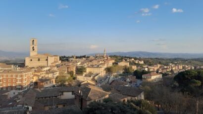
A new blue carbon map of the UK gives mud new meaning

I recently spent a sunny morning aboard Falcon Spirit, a University of Plymouth research vessel. As the boat motored along the south Devon coast, I spoke to Joan Edwards, director of marine policy for The Wildlife Trusts, about some exciting new research that maps blue carbon habitats in UK seas.

It’s long been understood that ocean habitats play a key role in storing carbon from the atmosphere, but until now, nobody has known exactly how much ends up in kelp, seagrass meadows, salt marshes and sediment in the seabed. Quantifying this, Edwards says, is the first step to minimising any damage caused by human activities such as commercial trawling to the most carbon-rich ecosystems in the ocean.

Today, Mike Burrows and other scientists at the Scottish Association for Marine Science reveal that 244 million tonnes of organic carbon are stored in just the top 10cm of seabed habitats around the UK. Most (98%) of that is in mud or silt that’s quite easily overlooked when it comes to conservation measures.

Anna Turns on board the Falcon Spirit.
CC BY-NC-ND

I’m Anna Turns, senior environment editor, and you’re reading the Imagine newsletter – a weekly synthesis of academic insight on solutions to climate change, brought to you by The Conversation.

This week, I’ve set sail from Plymouth Sound to explore the significance of blue carbon, while Jack Marley searches for razor shells on Northumberland’s tidal mudflats.

So what does blue carbon actually mean? In simple terms, it’s the carbon that is captured and stored by ocean habitats. The new report from scientists at the Scottish Association of Marine Science gives the UK “an opportunity to show the rest of the world just how important blue carbon is and why we need to protect it” as Michael Burrows says. That’s because, “when unharmed, marine habitats naturally absorb carbon and prevent it being released into the atmosphere,” explains Burrows, the professor of marine ecology who led this Scottish Association of Marine Sciences project.

New data from this blue carbon mapping project shows that UK seabed habitats could capture almost three times as much carbon as UK forests do per year. This has huge implications – knowing where the biggest blue carbon stores are will influence decisions about which areas should be prioritised as marine-protected areas and which may be better suited for future developments such as offshore wind.

Danielle Clifford, marine conservation officer for The Wildlife Trusts, Samuel Wrobel, senior policy at RSPB with Joan Edwards, director of marine policy for The Wildlife Trusts.
Anna Turns, CC BY-NC-ND

As the Falcon Spirit passed Cawsand Bay, where seagrass meadows thrive beneath the waves (partly thanks to advanced mooring systems that allow these marine plants to regenerate), I was amazed to learn that these beautiful habitats are only part of the story.

Carbon superhighways

Just like leaf litter in a forest, the fronds of seagrass or kelp that break off in the shallows get transported further offshore. When they sink, carbon gets incorporated into the sediment. Edwards explained that “plankton snow” is another major source of carbon – when these tiny plants and animals die, they sink to the seabed and the carbon they contain ends up being stored as blue carbon.

In the Southern Ocean, small shrimp-like crustaceans called krill are fished commercially. A recent study found that these Antarctic krill store at least 20 million tonnes of carbon annually as their poo and other waste products sink to the deep ocean.

Angus Atkinson, a professor of marine ecology at Plymouth Marine Laboratory, describes the potential of this “carbon superhighway”: “For the first time, we used a computer model of ocean currents to show these waste products don’t need to reach great depths to achieve storage for at least 100 years, further enhancing the carbon storage potential of krill habitats,” he writes. Remarkably, this makes carbon storage from krill equivalent to that of the world’s mangroves, salt marshes and seagrass beds.

Scratching the surface

As research goes, marine scientists are only just scratching the surface of life in the seabed. Marine ecologists from the Convex Seascape Survey, a multidisciplinary research project exploring blue carbon stored in the world’s seabed, describe this ecosystem as a “bustling metropolis” where burrowing lugworms, sea potatoes and bobbit worms mix sediments.

“Convex Seascape Survey scientist Adam Porter is developing pioneering techniques for photographing and measuring the sediment moved by urchins and other species in the lab,” writes Benjamin Harris, a researcher at the University of Exeter. “Results from these experiments allow us to estimate the amount of carbon being moved downward into the seabed and stored by these animals on a seascape scale, which could be colossal.”

Protecting global hotspots

For South Africa’s first national blue carbon sink assessment, Jacqueline L Raw, marine researcher at the Nelson Mandela University, focused on mangroves, salt marshes and seagrass, which she calls “the definitive blue carbon ecosystems”. While mud and silt weren’t covered by her study, Raw explains how the soils of those other blue carbon ecosystems are waterlogged with salty seawater: “This prevents the stored organic carbon from being converted back to CO₂ through remineralisation,” she says. “If left undisturbed and subject to certain conditions, these carbon stocks can build up over centuries.”

Now that blue carbon is being measured, albeit in discrete patches around the globe, the question moves on to how best to manage the sea to protect those precious stores. With goals to protect 30% of the world’s oceans by 2030, the UK’s new blue carbon map is timely.

Blue carbon only emerged as a mainstream global climate solution relatively recently, with substantial discussions about blue carbon gaining momentum in the run-up to the COP27 climate summit in Egypt in 2023.

As William Austin, professor of marine geology at the University of St Andrews and Rebecca J McLeod, senior research fellow in marine ecology at the University of Otago, ask: “Marine sediments provide the largest store of organic carbon on Earth, so why aren’t we looking to the sea as we plan our way out of the climate crisis?”

It turns out that fjords in temperate areas such as New Zealand have some of the highest potential for carbon storage and are “hotspots of carbon burial”. Scotland’s sea lochs need robust protection for this same reason and the Scottish government is leading the way – blue carbon potential is now part of the selection criteria for sites designated as Highly Protected Marine Areas.

Indonesia may soon take similar steps. With 22% of the world’s mangroves and 5% of seagrass meadows, protection from industrial fishing, mass tourism and mining is set to increase across this archipelago. But critically, protecting seagrass is “quite tricky” because an Indonesian seagrass map has not yet been completed, as Brurce Muhammad Mecca and Astra Rushton-Allan from Australia-based research organisation Climateworks Centre, point out.

Only with baseline data and ongoing mapping can the amount (and potential decline) of blue carbon be properly monitored. So the bottom of the ocean needs to become a top priority, and quickly.

Thanks to everyone who pointed out the glaring error in last week’s newsletter: methane is composed of four hydrogen atoms and one carbon atom, not the other way around as I suggested. One shudders at the thought of an atmosphere capable of harbouring such a monstrous compound. It may interest you to know, kind reader, that your humble author got a D in A-level chemistry – Jack.

Don’t have time to read about climate change as much as you’d like?
Get a weekly roundup in your inbox instead. Every Wednesday, The Conversation’s environment editor writes Imagine, a short email that goes a little deeper into just one climate issue. Join the 35,000+ readers who’ve subscribed so far. Läs mer…

The new climate stripes? How creativity can inspire environmental action

Without context, vast numbers are meaningless. Data can be incredibly dry, abstract and difficult to visualise. But sometimes scientists find clever ways of presenting complex information in creative, eye-catching and more tangible forms.

In 2019, Ed Hawkins, a climate professor at the University of Reading, created “climate stripes” to illustrate the global average temperature for each year since 1850 in the form of a coloured stripe. Now a cultural icon, these simple blue and red graphics have appeared on football kits, music festival stages and even a Tesla.

Last week, scientists launched new air-quality stripes to depict how concentrations of ultrafine particles known as particulate matter have changed in 176 cities worldwide since 1850. The global threat of air pollution is often considered an invisible killer, but these colourful diagrams show some stark global contrasts. Some offer hope.

Read more:
These colourful diagrams show how air quality has changed in over 100 countries around the world since 1850

This roundup of The Conversation’s climate coverage comes from our award-winning weekly climate action newsletter. Every Wednesday, The Conversation’s environment editor writes Imagine, a short email that goes a little deeper into just one climate issue. Join the 35,000+ readers who’ve subscribed.

Hawkins makes complicated climate data accessible to all by using shades of blue to represent cooler years and red for warmer years. “Helping science to make this leap from the lab to social media is crucial to changing mindsets,” he writes.

“My research has often focused on communicating the impacts of climate change to new audiences. The more people that see and understand this huge problem, the better chance we have of solving it.”

Read more:
#ShowYourStripes: how climate data became a cultural icon

For critical issues like the climate crisis and air pollution, visual storytelling is a powerful tool. By translating statistics into colourful diagrams that tell a story, changing trends become more apparent, relatable and relevant.

Jim McQuaid, an atmospheric scientist at the University of Leeds who helped create the new air quality stripes, remembers the steel furnace smell once common in Britain, which decreased drastically after the Clean Air Act was introduced in 1956.

London’s air quality stripes illustrate how the industrial revolution in Britain triggered various smog events, one of which killed up to 12,000 people in 1952. But stripes switch from red and orange to more yellow (moderate) and sky blue (fair) as industrial and transport emissions were targeted by the subsequent Clean Air Act in 1993.

Read more:
70 years on from London’s Great Smog, we still need cleaner air to protect health

The Beijing stripes show how concentrations of particulate matter rose rapidly with China’s industrial development from the mid-20th century.

But when the 2008 Olympic Games took place, drastic steps were taken – factories were shut or moved away from the city while millions of cars were taken off the road. Dark brown (extremely poor) air quality stripes revert to a lighter shade of orange (poor air quality).

Read more:
China’s smog kills more than a million each year – but there’s a clearer road ahead

Climate drivers

Climate and air pollution are intrinsically linked. Many air pollutants are also known as “climate forcing agents” – they drive the climate crisis. Sooty components of particulate matter known as black carbon have a warming effect.

But other pollutants, notably human-made aerosols including sulphate from industrial chimneys, have the opposite effect. These small particles of pollutants are left suspended in the air and can seed clouds.

Read more:
Air pollution: science shows there’s no safe limit – here’s how laws must change

More particulate matter means more clouds and crucially smaller cloud droplets – this increases the amount of sunlight reflected back into the atmosphere. As scientists at the University of Oxford have found, “all of this increases the amount of sunlight that clouds scatter back to space instead of being absorbed by the Earth”.

By slightly cooling the climate, human-made aerosols mask some of the warming from greenhouse gases – this is known as “global dimming”. But that’s far from good news, because aerosols and their cooling effect are short-lived.

“While the CO₂ emitted into the atmosphere today from cars and coal power stations will still be there centuries later, the aerosols emitted as air pollution will cease to have an influence a month from now,” write Peter Manshausen, Duncan Watson-Parris and Philip Stier from the University of Oxford.

“This means that as soon as we stop emitting aerosols, their buffering effect on climate change disappears, while the greenhouse gases in our atmosphere will continue to heat the planet.”

Read more:
Air pollution cools climate more than expected – this makes cutting carbon emissions more urgent

Mapping pollution

In Mukuru, an informal settlement in Nairobi, Kenya, scientists have been working closely with the local community to raise awareness about the severe health effects of air pollution through theatre, storytelling, photography and drawing. Artists from the Mukuru-based Wajuuku Arts Centre painted maps on canvas and took these out into the community so that residents could identify pollution hotspots and sources.

Read more:
Using art to tackle air pollution: a story from a Nairobi slum

Using creativity was key to the project’s success, according to researchers Cressida Bowyer at the University of Portsmouth and Heather Price at the University of Stirling.

“If we had gone into the community with aims and ambitions that had already been decided according to the commonly acknowledged causes of air pollution (traffic, industry, cooking methods) we may not have had space to reveal or acknowledge these other sources,” they say.

“Instead, we identified issues that the community recognises as indirect causes of air pollution, such as workers’ rights, alleyways between dwellings that are too narrow for fire-fighting equipment, and poor waste management.”

Even between neighbourhoods, the pollution picture can vary. The best visual tools represent as much nuance as possible.

Read more:
Why eye-catching graphics are vital for getting to grips with climate change

James Cheshire, professor of geographic information and cartography at University College London points out that uncertainty is difficult to communicate in any one single image, chart or graph.

“One misconception about the climate crisis is that warming will be uniform across the world,” he says, explaining that oversimplified graphics risk missing the “complex patchwork of effects” behind the headline figures. “Maps can be an invaluable weapon against this misunderstanding.”

Scrolling through time or space is a great way to capture intricacies and highlight anomalies at different scales. Visual storytelling offers hope, not only by demonstrating progress but also by connecting more people with the problem and amplifying possible solutions. Läs mer…